Top Arts: VCE 2006
Free entry
The Ian Potter Centre: NGV Australia, Fed Square
Ground Level
16 Mar 07 – 3 Jun 07
A major event in the annual school calendar, Top Arts: VCE 2006 presents outstanding work completed by young student artists as part of their assessment for VCE Art and Studio Arts.
VCE Art requires students to complete a body of works that involves a broad and innovative investigation and the progressive realisation and resolution of ideas, directions and individual concepts, either in an exploratory folio or through one or more visual solutions. VCE Studio Arts requires students to complete a design process that defines an area of exploration in a work brief and the production of a cohesive folio of finished works of art.
This exhibition highlights the National Gallery of Victoria’s strong commitment and support of contemporary art, arts education and showcases the ideas and attitudes of young people.
Katherine Phillimore
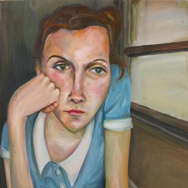
Wishful thinking 2006 (detail)
oil on canvas
76.2 x 61.0 cm
Art
Yarra Valley Grammar School, Ringwood
This series shows an adolescent girl from the suburbs, who I can easily relate to. I tried to capture seemingly insignificant moments with oil paint, which is a versatile and expressive medium, to show the beauty I see in the ordinary life around me. Through these works I am communicating an appreciation and observation of day-to-day life and how it oozes ‘ordinary’. I find this ordinariness is often overlooked and pushed aside. In creating this series I hope to evoke an appreciation of the ordinary things we so often encounter
Nathan Vernon
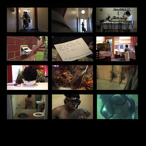
Something fishy 2006 (detail)
DVD
5 minutes
Art
Melbourne Rudolf Steiner School, Warranwood
‘Something fishy’ introduces a comic twist to the absurd lengths people go in order to feel in some way connected to a past lover. The work highlights the fruits that can be found by moving on. I deliberately used the ‘mid shot’ frequently to show the empty space surrounding Simon, in order to emphasize his feelings of being alone. I shot the film in HD, edited it in Final Cut Pro and composed the music on Sound Track Pro. My intention was to create a sketch that would demonstrate how people get stuck in a rut and how detrimental this can be to their wellbeing.
George McQueen
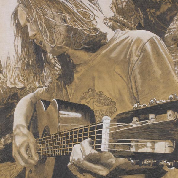
Acoustic Gold 2006 (detail)
pencil, brown chalk and white pastel on composition board
69.0 x 45.0cm
Art
Yarram Secondary College, Yarram
The concept behind this piece was to capture the serenity of acoustic music by using a streamlined perspective to convey atmosphere and reflect the natural tranquillity of the scene. The soft tones of the board along with the darker pencil shadows and white highlights were used to convey mood, light and form. In creating this piece I focused on maintaining an earthy look that reflected the soul of the image. I worked on refining forms and blending tones, using white pastel highlights to convey a sense of light.
Emma Franklin
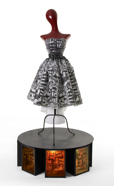
Sleep 2006 (detail)
interfacing, wood, fluorescent light, plastic, sequins, beads
174.0 x 97.0 x 97.0 cm
Art
Mater Christi College, Belgrave
The concept directing my artwork was sleep, which is inherently necessary for all humans to be able to function. The symbolic imagery of the dreams and nightmares is a consequence of personal experience. The constructed nature of both garment and illuminated boxes imitates the systematic process involved in the nightly incursions into the human mind.
Bridget Noonan
Bridget Noonan
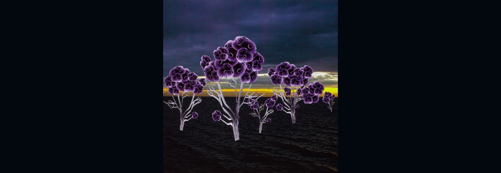
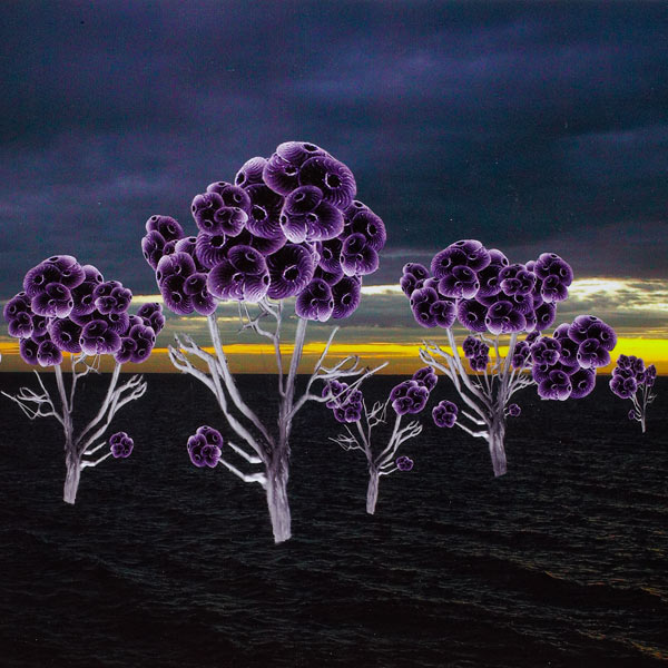
One work from the Sunset Boulevard series, 2006
Loreto Mandeville Hall, Toorak, Studio Arts
Studio Arts
Loreto Mandeville Hall, Toorak
Describe the ideas behind your work short–listed for Top Arts.
My artwork was inspired by botanical illustrations. However there is a slight twist! Each so called flower is constructed using alternate, attractive, yet repulsive objects. The majority of these works are a collection of skeletons, repulsive sea urchins, scaly reptiles and insects, oriental fans and African land animals just to name a few. I have applied my images in various ways, using photography, Latin names and oil and enamel on canvas.
What were your starting points? Where did your inspiration come from?
At the start of the year I was exploding with ideas and decided to pour them all out creating A4 collages with magazine cut–out images I had found and other random materials. From that one collage made from a boot and a snake looked similar to a botanical flower. I took this idea and created more flowers using alternate subject matter.
What media/materials did you select and why?
I used a Photoshop program (image manipulation program) on computer. This was used to fully manipulate the ordinary images I found into the flower stereotype. I created an antique botanical book to link my modern flowers to its traditional botanical style and used enamel and oil on canvas to create a textual background for candy coloured alternate flowers.
How did new technologies influence your ideas or working methods?
As my work is largely based on computer, the new technologies of Photoshop certainly influenced my work and allowed me to create such individual pieces.
What challenges/difficulties/discoveries did you encounter in producing your work?
I had never used a computer manipulation program before so I had to completely familiarize myself with the program by trialling and experimenting. I learnt patience and backing up work on the hardrive are IMPERATIVE to avoid frustration and loss of work through a computer fault.
What influences from other sources were significant in the production of your work? For example: other artists, literature, media, historical or political events. How did this impact on the development of your work?
I feel I am a very individual artist and thrive off my own creativity and interesting ideas which is represented through my “different” pieces. Hence, I really didn’t use other artists in the development of my work. However I looked at Fiona Hall’s works as she also uses botanical images in a modern interpretation.
What resources did you access e.g. Libraries, galleries, newspapers, magazines, art programs, websites, films, events and performances.
In my works I had to source many images to incorporate into my flower designs. I found these on the internet, magazines, and various brochures and images I had collected off the street, also from books.
What exhibitions did you see in 2006? Was there a specific exhibition that influences the development of your ideas and working methods?
I love viewing other people’s work. I find it therapeutic and interesting to see what others have created. I saw Ben Frost, Picasso, constantly visited NGV and Flinders Lane galleries and galleries in Byron Bay. However none of these directly influenced my ideas and working methods.
Did you see Top Arts VCE 2005? If so, what was your response?
Top Arts: VCE 2005 was stunning and impressive. I felt I had a lot to live up to yet I was excited at the challenge to see what students of my age were able to produce and the quality of that work.
Did you refer to the NGV website – how relevant or useful was this site? Any other sites you found useful?
I did not refer to this site particularly for the reason that I am my own artist and would prefer to be original rather than copy what others have done in VCE. However at the start of the year I visited this site to see the standard of work that must be reached.
Did you consider presentation and conservation issues in the process and production of your work?
My workbook was based fundamentally on entertainment for the reader whilst piling them with the necessary information about the production and process of my works. IE: the journey of my process is documented by characters and funny images which keep the book flowing and the reader engaged.
What advice would you give to students undertaking Art or Studio Arts?
Never doubt yourself and allow your gut instinct to be set free. Allow one idea to branch and flow on to the next, you will end up in a place you never thought you would be, but that is what keeps it interesting.
What were the highlights of your studies in 2006?
Being able to step back and see where you started, where you finished and all the skills learnt on the way. It is an amazing and intense year, but the rewards of seeing your finished pieces on show are simply priceless.
Are you planning to pursue a career in the arts? What will you be doing in 2007?
Most definitely. I would love to study communications design/visual communication. My dream is to some day work for a magazine doing art direction and layout. I am obsessed with the design and the graphically “cool”.
Sopheea Rehe
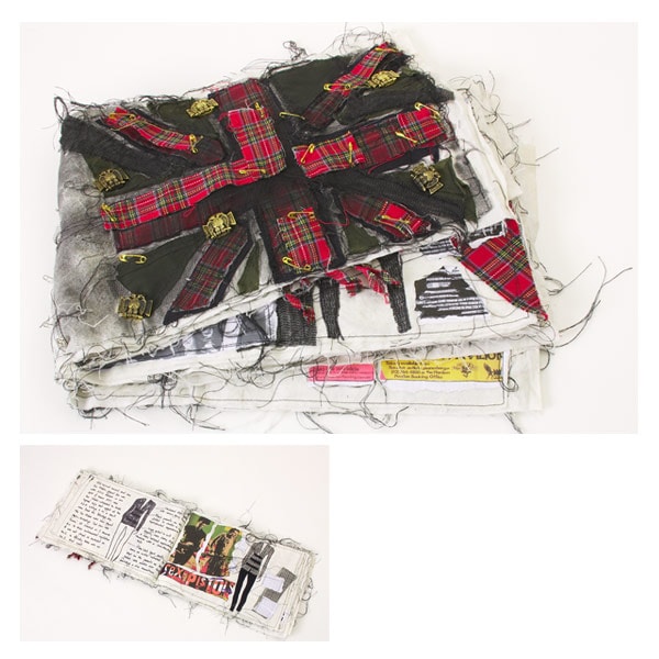
Punk cloth 2006 (detail)
calico, inkjet print, thread, tulle, cotton, markers, safety pins, metal, plastic, spray paint
24.5 x 39.0 x 3.0 cm (closed); 77.0 x 24.5 cm (open)
Art
Bendigo Senior Secondary College, Bendigo
My intention was to create a piece that would explore the style and meaning of punk music and fashion in the 1960s and 1970s in a single presentation. I created my own designs and used sewing to create a cloth book consisting of twenty pieces of clothing. I incorporated annotations and research and printed photographs that related to the theme.
Lauren Barry
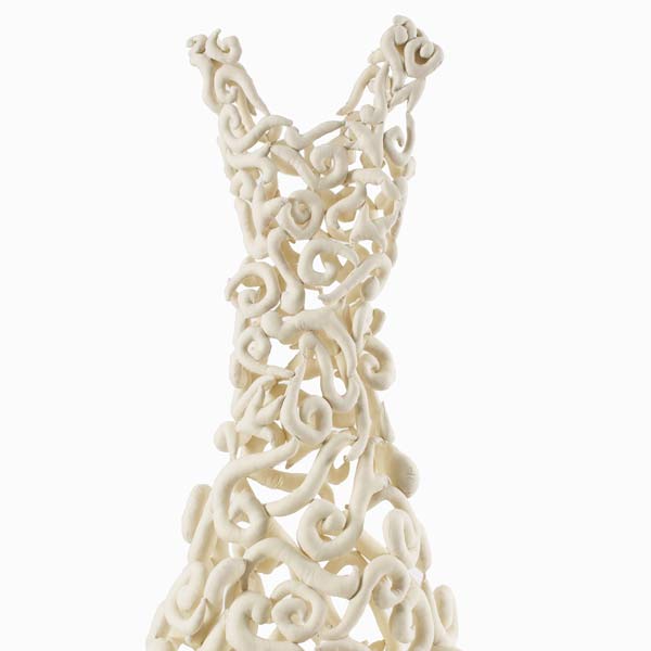
Untitled 2006 (detail)
calico
centre back: 115.0 cm; waist (flat) 29.0 cm
Art
I explored the theme of pattern and the female form in my work. I wanted to create the notion of the female via a dress, something with female associations but without being too literal an interpretation. The pattern was created using soft sculptures made with calico. The flat colour encourages the viewer to focus on the tactile nature of the work, enhanced by the use of shadow in the installation. I used a sewing machine to make the varied shapes and hand-sewing to create the organic, swirling form.
Tim Sleeth
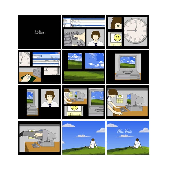
Bliss 2006 (detail)
DVD
1.5 minutes
Art
Whitefriars College, Donvale
I was inspired to create this work whilst staring blankly at my computer, trying to think of an idea. I noticed the background ‘Bliss’ and I created this animation, focusing on the monotony of work and the respite resulting from daydreaming. The work was created using Adobe Flash and I recorded the music myself, playing guitar and keyboard. The major challenge of animation is the time it takes to create the thousands of frames required.
Tobias Koster
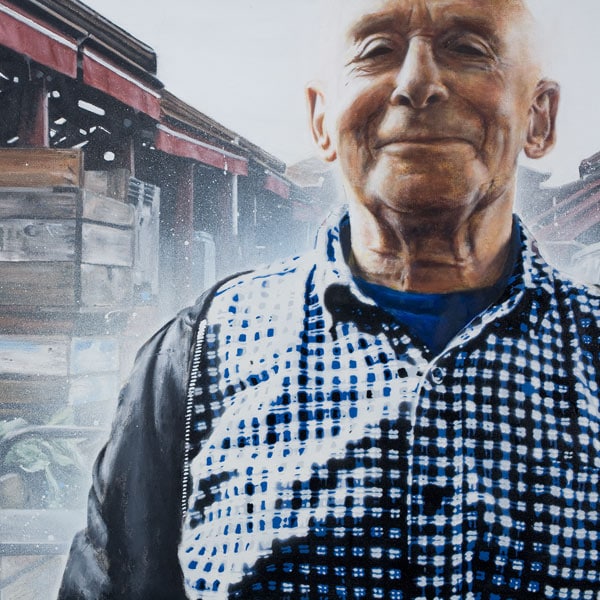
Alex from the market 2006 (detail)
oil and enamel on canvas
91.2 x 213.5 cm
Art
St Leonard's College, Brighton East
My folio focused on portraiture. The intention of this piece was to reveal Alex’s inner emotion through expression and colour, reinforced by his surroundings in this case, pride in his work. I used digital photography and Photoshop to create the desired image from two pictures taken at the Victoria Market, then painted in oils. I created a six-layer stencil consisting of four shades to create the desired effect for Alex’s shirt. A major inspiration was the International Stencil Festival in Melbourne.
Holly Bradshaw
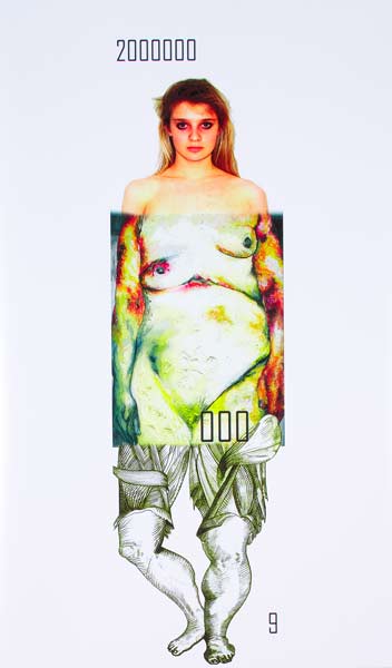
from the Australia today series 2006 (detail)
inkjet print
94.0 x 60.5 cm
Art
Caulfield Grammar School, East St Kilda
The aim of Australia Today was to confront the viewer with the prevalence of eating disorders, obesity and anorexia. My work highlights this burden of disease in Australia using statistics and images. Although the piece is divided into three separate panels, the numbers, which may at first seem miscellaneous, become unified when read horizontally. In the first row the digits indicate three strata groups, the number of males, homosexuals and females respectively. The second and third rows display the large number of people suffering from obesity and anorexia in Australia. Furthermore, my piece challenges the audience to question why these statistics are of this magnitude. Is it because we live in a superficial society demanding perfection? Has our culture accepted a sedentary lifestyle?
Kristian Rasmussen
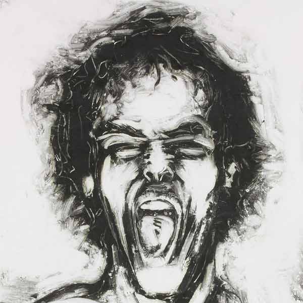
Lose the nerve 2006 (detail)
monoprint
50.7 x 35.0 cm
Art
Eltham High School, Eltham
Charles Ferry

Shipyard 2006 (detail)
inkjet print
90.4 x 30.8 cm
Art
Melbourne Grammar School, South Yarra
My aim was to show the mystery and darkness of an abandoned shipyard near Vancouver, Canada. Located on the side of a highway, it is often missed by passers-by. I wanted to capture the beauty hidden in the lonely, derelict ship, which looked as if it had been frozen in time. Photography enabled me to communicate the atmosphere of the scene. The ship’s hard texture, with its flaking paint, is contrasted with the soft stillness of the water and clouds. I created a vertical-format ‘panorama’ by combining and layering three individual photos to show the grandeur of the ship. I have been influenced by the atmospheric photography of Ansel Adams and the dark, shadowy work of Bill Henson.
Catherine Smith
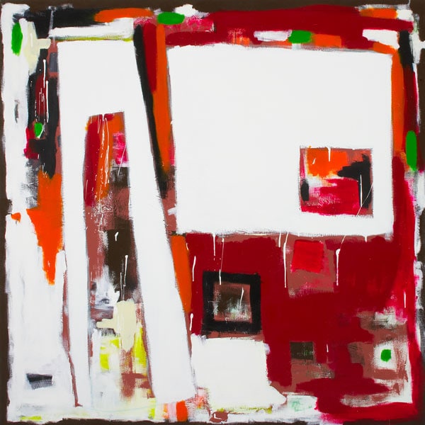
Shape two 2006 (detail)
synthetic polymer paint on canvas
151.0 x 150.0 cm
Art
Ballarat and Clarendon College, Ballarat
‘Shape two’ is an exploration of the art element shape, and shape is the subject of my work. I am really interested in abstract art, and this work on canvas was a spontaneous response to this style. I worked without knowing what I was going to paint next, but a large part of my technique was layering the surface of the canvas to create dimension and textural qualities. I painted many blocks of colour on the surface and kept applying layers until I achieved the desired texture. My focus on exploring the element of shape was inspired by the work of Mark Rothko.
Gideon Szental
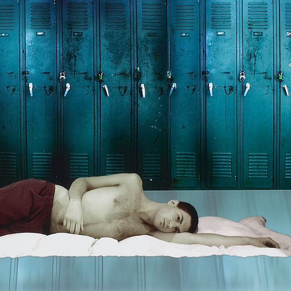
On the edge 2006 (detail)
inkjet print
22.5 x 67.5 cm
Art
Mt Scopus College, Burwood
My photography series aims to explore emotional fragility through symbolism. Each of the central characters looks outward and transcends the reality that surrounds them. The characters look at their own plight, but are both helpless and unwilling to stop what is happening to them. Each is falling apart. However, behind this turmoil are the visible suggestions of hope. The characters are acutely aware of their transience; they are fragile like glass, they can break at any moment, or they can choose to simply look beyond.
Rosalie Lui
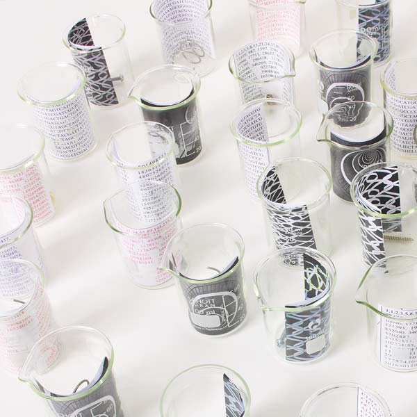
The golden spiral 2006 (detail)
glass, inkjet print, metal, shells
dimensions variable
Art
Presbyterian Ladies' College, Burwood
My intention was to connect art and science. The spiral is the culmination of this. I created different backgrounds “the DNA code and structures, the number sequence of shells and staircases” and combined them with various objects, such as screws, shells and wire. These were placed in 89 beakers to create a spiral, referring to the formulae and principles found in chaos theory and the Fibonacci number system. This reference focused on the interconnectedness of all things. The installation gives literal meanings to the different helical objects. The work was composed to be visually pleasing but close viewing will reveal numerous links and patterns. As with human DNA, endless codes, combinations and means of expression are involved in this work.
Ben Holland
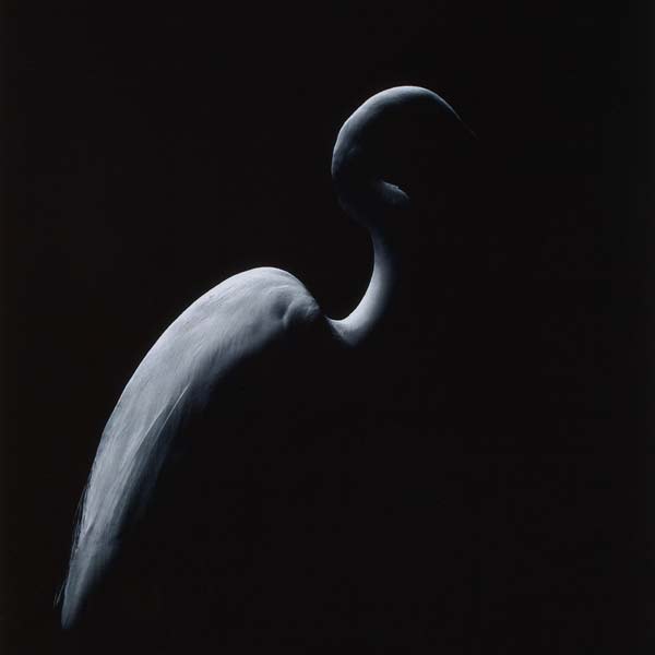
Illusions 2006 (detail)
inkjet print
26.5 x 47.0 cm
Art
Melbourne Grammar School, South Yarra
I wanted to draw attention to the exquisite beauty that exists in the natural world. The intricate arrangement of feathers inspired me to explore the artistic potential of this display. I used a very quick shutter speed and Photoshop to isolate the bird from the background.
Kyle Buchanan
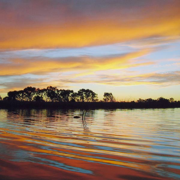
Day two 2006 (detail)
inkjet print
22.7 x 32.7 cm
Art
Boort Secondary College, Boort
My intention was to create a piece that explored the concept of Creation by focusing on the beauty and the complexity of a sunset. My inspiration came from my belief in Creation and the beauty of the natural landscape around my home town. It took many months of watching for th right sunset and many hundreds of photos to find the ones represented in my folio. Behind the beauty is the issue of drought. The water level in the Boort Lake, where these photos were taken, was dropping significantly. These photographs were taken with a digital camera, using a traditional method, and were not edited in any way.
Matthew Harding

Matthew Harding
From Nike roof
2006
from the Scene and unseen series
inkjet print on canvas
29.9 x 213.0 cm
Marcellin College, Bulleen
Studio Arts
Studio Arts
Marcellin College, Bulleen
Describe the ideas behind your work short–listed for Top Arts.
During the year I aimed to capture elements of Melbourne’s city which are unseen by the general public. I liked the idea of capturing Melbourne through photography from locations where people had to ask how and where I captured the image. My images aimed to capture the entire space from each of my locations. A 360 degree panorama enables the viewer to observe the entire space in a single image.
What were your starting points? Where did your inspiration come from?
Whilst on Christmas school holidays I went to a photographic exhibition put on by RMIT university graduate class of 2005. The exhibition was named seg_ue and was held at Federation Square in the Atrium. The work was amazing and I was especially inspired by photographer Rodrick Bond who captured some panoramic photographs of various locations throughout Europe. After seeing his work I was inspired to go and create my own panoramic images of Melbourne.
What media/materials did you select and why?
I chose to use photography as it has been a passion of mine and gives me the ability to capture almost any environment. I chose to print my images onto canvas because it is the medium typical of the fine art world and I am taking art off the streets and making it accessible to a wider audience.
How did new technologies influence your ideas or working methods?
Through digital photography I was able to take dozens of photographs in sequence from each of my locations and be given instant results of the image quality. Then, using special panoramic editing and stitching software I was able to arrange and blend the photographs seamlessly to form one 360 degree image.
What challenges/difficulties/discoveries did you encounter in producing your work?
Gaining access to specific locations such as rooftops in Melbourne CBD was a challenge. Initially my knowledge of photographic editing programs was limited. However, in order to complete my work I sought out online help through tutorials and spoke to professionals. Another challenge was capturing the image in the right lighting conditions. This meant returning to locations on several occasions, sometimes at midnight or early morning.
What influences from other sources were significant in the production of your work? For example: other artists, literature, media, historical or political events. How did this impact on the development of your work?
The inspiration for my folio came from the street artists themselves (who are unidentified through use of pseudonym) as well as some of the great panoramic photographers. David Hockney’s ‘My Mother’ showed the possibilities of montage, a technique that I could employ with panoramic photography. Films such as ‘Style Wars’ and ‘Beat Street’ taught me the origins of graffiti culture whilst ‘RASH’ documented the emerging street art culture in Melbourne.
What resources did you access e.g. Libraries, galleries, newspapers, magazines, art programs, websites, films, events and performances.
I avidly read everything that I could get my hands onto that related to photography and art. I regularly visited commercial, public and artist–run galleries during 2006, including Bus, Per Square Metre, NGV, Flinders Lane Gallery and City Lights – Until Never Gallery.
What exhibitions did you see in 2006? Was there a specific exhibition that influences the development of your ideas and working methods?
The most influential exhibitions were those run at City Lights – Until Never Gallery in Hosier Lane. It was here that I was given the opportunity to meet several of the street artists who featured in my work.
Did you see Top Arts VCE 2005? If so, what was your response?
As a prospective year 12 studio arts student I attended Top Arts 2005. The exhibition inspired and motivated me to do my best in 2006.
Did you refer to the NGV website – how relevant or useful was this site? Any other sites you found useful?
I enjoyed reading through profiles of artists on the NGV website.
Discuss any ethical or moral issues or concerns evident in your work?
The scope of my work was varied. I did not have any ethical issues in my city view images, however I did have concerns when it came to my graffiti images. I am photographing other people’s artwork. This was a moral issue to me, however I justified this by creating views which are not simply visible to the human eye. I am also changing the medium, by taking the art from the streets and putting it onto canvas.
Did you consider presentation and conservation issues in the process and production of your work?
I used Print Guard to protect my work from any sunlight and damaging effects of ultraviolet light. I want my images to last as long as possible.
What advice would you give to students undertaking Art or Studio Arts?
Students should start thinking about what they want to achieve before the year commences. Go to as many galleries as possible and familiarise yourself with the fine art world. Be passionate about your work.
What were the highlights of your studies in 2006?
Being supported and recognised by those around me including family, friends and teachers. Fulfilling my vision and seeing the final work on canvas was the highlight of 2006.
Are you planning to pursue a career in the arts? What will you be doing in 2007?
I plan to study photography at university in 2007. I have applied for fine arts courses as well as applied photography.
David Saretta
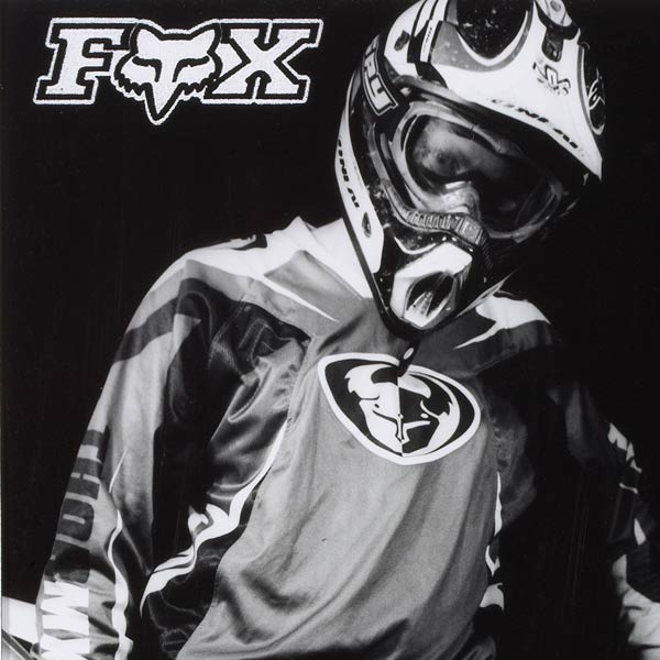
‘Nine o’ four’ 2006 (detail)
gelatin silver photograph
24.0 x 17.4 cm
Art
Marcellin College, Bulleen
The concept for my work was to produce photographs that would create aesthetic images of motocross gear. My ideas came from a Fox catalogue of the latest range of protective clothing that I had browsed through earlier in the year. I used techniques such as over-developing to create contrast, as well as slow shutter speeds and high apertures to take in as much focus, detail and depth of field as possible. Correct lighting was important for the clarity of the images.
Emily Ryan

Emily Ryan
Individuality (noun) 1. Unique?
2006
inkjet print
128.0 x 24.0 cm
St Monica’s College, Epping
Studio Arts
St Monica’s College, Epping
Describe the ideas behind your work short–listed for Top Arts.
My works explore the conflicting ideas questioning whether we are truly all individuals, or just another face in the crowd. Through a number of symbols I worked towards creating a piece that poses more so a question, rather than a statement on how we view ourselves today.
What were your starting points? Where did your inspiration come from?
Often my observation comes from observing people in the city; on public transport, walking down the street, having coffee. I enjoy how it reminds me that we are all so very unique, in appearance, behaviour and personality. However also alerts me of the negative aspects, that at some point in our lives we may question our existence in the world, even feel small or overwhelmed.
What media/materials did you select and why?
My artwork combines photographs with linocut prints, collected textures and materials combined digitally and manipulated with Photoshop. As my theme involves that of the people of Melbourne and the Melbourne setting itself, I felt photography was the only means of capturing the life that the streets have. Contrasting with the detail of the photos, I wanted to take on an almost surreal aspect by having the linocut prints and finally digitally manipulating the composition to remind my viewers my work is about exploring thoughts on life, rather than creating a statement.
How did new technologies influence your ideas or working methods?
The photographs were taken mostly with a digital SLR camera. By using digital photography gave me the freedom to take many photos, preview them and alter them very easily through Photoshop. It allowed me to collage the materials with blurs and filters as well as cutting out objects.
What challenges/difficulties/discoveries did you encounter in producing your work?
Printing on such an odd and large scale meant keeping files of the photos and scanned images at the highest resolution possible while working on them. This made it a little hard working with very large files. The image also exceeded any standard printing range, so I approached a custom printing business.
What influences from other sources were significant in the production of your work? For example: other artists, literature, media, historical or political events. How did this impact on the development of your work?
Korean artist David Choong Lee’s elaborate collages and oil paintings of homeless people and recycling ‘rubbish’ into works that not only portray the street but use materials from the streets inspired me to attempt to try and give my viewers an immersing experience. His work often requests a deeper look into the work and to form some sort of opinion, even if it isn’t that of the artist’s; an idea I wish to also convey. British artist David Hockney inspired me to incorporate a fragmented appeal to my work, symbolizing the fragility of life and thus its importance.
What resources did you access e.g. Libraries, galleries, newspapers, magazines, art programs, websites, films, events and performances.
Images; that I collected from library books, newspapers, art magazines, image searches on the Internet etc. Images often helped me to further develop ideas and create new ones.
What exhibitions did you see in 2006? Was there a specific exhibition that influences the development of your ideas and working methods?
I visited the Pissarro and Picasso exhibitions, Stanley Kubrick, Top Arts and Top Screen exhibits and screenings. Pissarro, while studying him in the classroom, encouraged me to want to include more etchings or prints in my work. To work like he did with new technology and try and think outside the square a little, to try something new and explore.
Did you see Top Arts VCE 2005? If so, what was your response?
I did see Top Arts: VCE 2005 and found a variety of works that inspired me so to not hold back with my thoughts, to try something big and be free to express myself without fear of criticism. The variety of mediums, aesthetic detail and themes I feel was celebrated well in 2005. It presented a diversity that I and I believe my class felt was good to take away.
Did you refer to the NGV website – how relevant or useful was this site? Any other sites you found useful?
Reading the experiences of other Art and Studio Arts students helped me develop my own approach on how to tackle completing Studio Arts. By reading how others got ideas inspired me to just express myself and learn; to not worry about grades being the sole drive.
Discuss any ethical or moral issues or concerns evident in your work?
I felt the effects of the media had to be addressed in my work a little. So I included the television, street sign and traffic light, resembling direction – its influence upon our beliefs and actions, how we may be easily manipulated to think alike or dress like one another, merely to fit in.
Did you consider presentation and conservation issues in the process and production of your work?
As soon as I got the images printed I decided to get them mounted and framed professionally, as the images were printed on high quality photo paper, they were fairly delicate. By framing them I hope to keep them in the best condition possible.
What advice would you give to students undertaking Art or Studio Arts?
Studio Arts tests not only your artistic skill. Your ability to project an idea to the world and develop that idea until it is exhausted is also undertaken. Develop and explore. Be free with ideas and don’t throw anything away. Discover new things and put your heart into your work. A theme that is significant to you is important. But above all, have fun and enjoy.
What were the highlights of your studies in 2006?
Studio Arts creates an energy in the classroom that no other subject does. There are feelings and opinions being displayed on canvas, through sculpture and on paper everywhere. Throughout the year your peers mature and with that so do ideas. Having our works exhibited at our school exhibition was a delight and to be the recipient of our “Principal’s Art Prize” was an honour. To be short–listed for Top Arts however, was a dream unimaginable.
Are you planning to pursue a career in the arts? What will you be doing in 2007?
I hope to apply my interests in films and photography into filmmaking to become a cinematographer or explore animation. I have applied for the VCA to study Film and Television as well as Swinburne University.
Rebecca Chua
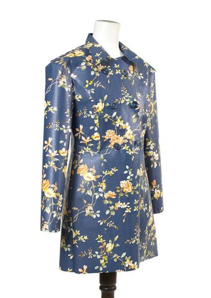
Wallflower dress 2006 (detail)
wallpaper, buttons, masking tape, thread
centre back:89.0 cm; waist (flat) 60.0 cm
Art
Camberwell Girls Grammar School, Canterbury
My aim this year was to create unique clothing which would challenge the accepted view of fashion design. I decided on making a garment utilising a material not usually used for clothing wallpaper that was machine and hand-stitched. I manipulated the wallpaper and created the shape of the dress around my body after researching and testing the wallpaper’s properties. Through making the work I gained a greater understanding of the construction of clothing and the way patterns and designs can communicate different emotions.
Benita Whatley
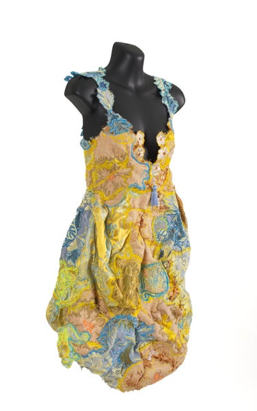
Extravagance 2006 (detail)
rayon, cotton, satin, tulle, organza, cotton tassel
centre back: 61.0 cm; waist (flat ) 47.0 cm
Art
Genazzano F.C.J. College, Kew
Inspired by the Baroque and Rococo periods of France and Italy and the extravagances, splendour and grandeur of these eras, I wanted to create a garment that was exaggerated in shape and form and elaborate in texture and detail. My intention was to combine the architecture and the fashion of this time in my design, giving it a modern twist. Both the fashion and architecture from these periods displayed many intricate forms which I wanted to reflect. I was also inspired by the Spanish designer Antonio Gaudi’s use of organic shapes. I experimented with a variety of techniques on both commercial and vintage material to construct a delicate but madly embellished fabric, rich in colour and design. I have transformed a variety of Italian vintage fabrics to give them new life by cutting back, overstitching, manipulating and shaping them.
Harley Taylor-Marshall
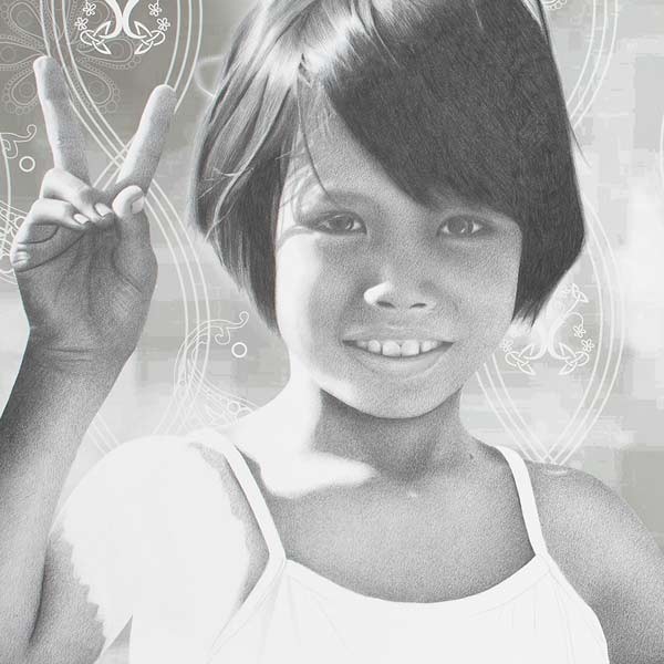
Cambodian kids 2006 (detail)
pencil and inkjet print on paper
70.0 x 112.0 cm
Art
Caulfield Grammar School, East St Kilda
By use of positive imagery, both in the figure and ground, this piece expresses hope about humans and their relationship with the environment. Rather than conveying the more stressing issues, this piece uses subtle symbolism and imagery to present the good in the world. It was created with both graphite pencil and information computer technology to combine the traditional with the contemporary.
Lydia Wegner
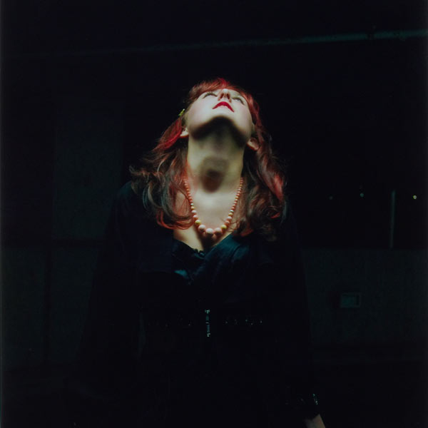
Level five 2006 (detail)
inkjet print
45.5 x 30.5 cm
Art
Eltham High School, Eltham
Working in industrial and suburban areas at night I found the low light conditions revealed a moody and atmospheric feel, exposing elements not seen in daylight. A local multi-level car park gave me the perfect setting for this series of photographs, a place populated during the day and deserted at night. The concrete areas became textured, creating a mysterious depth that characterised a place of isolation and emptiness. The model was placed to give proportion and perspective as well as to reinforce the notion of loneliness in a concrete maze.
Andrey Walkling
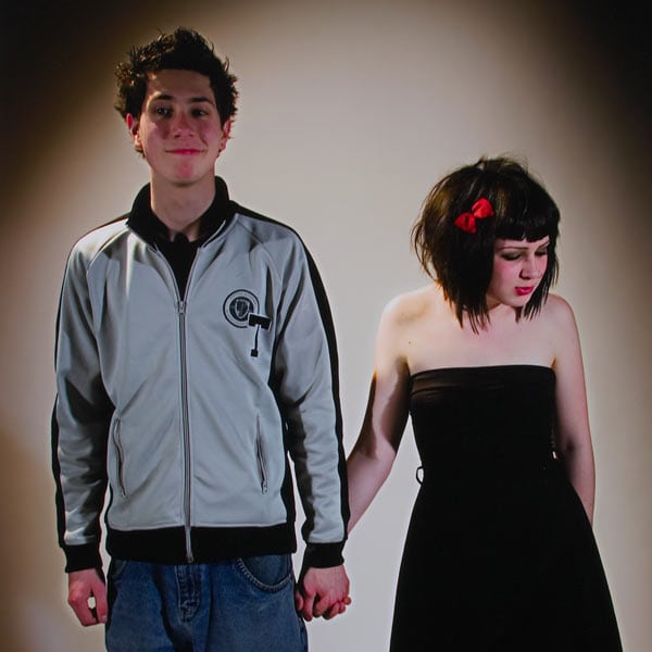
We go together 2006 (detail)
inkjet print
91.5 x 58.0 cm
Art
Viewbank College, Rosanna
My work examines issues surrounding identity and its formation and displacement in contemporary culture. It questions how social expectations and regulations place constraints on emotional knowledge, about what it means to be an individual, and what makes a fulfilled identity. It explores elements of institutions, socialisation, memory, personality and place. My idea is that a combination of real, remembered and imagined images may more completely document a person or event than traditional photographic practice.
Grant Ellis
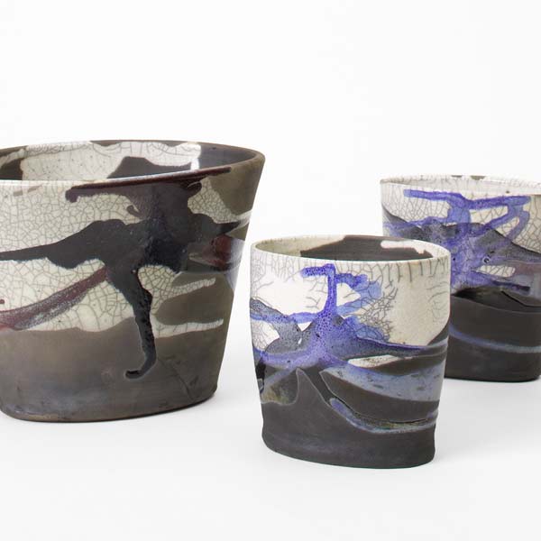
stoneware
18.6 x 24.5 x 19.0 cm; 15.0 x 14.7 x 10.5 cm; 13.6 x 14.2 x 10.8 cm
Art
Camberwell Grammar School, Canterbury
My works explore the concept of families or tribes representing co-dependence and unity. I was influenced by Gwyn Hansen Piggott and Shoji Hamada. The forms were wheel-thrown, the ovalbased shapes formed on the wheel and placed on a hand-built base. Glaze was poured and splashed on. I like the versatility of ceramics and the potential to create a range of effects.
Matt Murphy
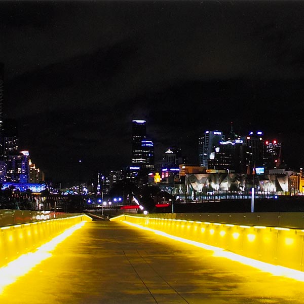
Bolte Bridge 2006 (detail)
inket print
16.0 x.58.7 cm
Art
Whitefriars College, Donvale
My theme for the year was cityscapes. Much of my inspiration came from films such as Vertigo, Collateral and The French Connection. I found that these films incorporated cities as characters, not just as locations. The Bolte Bridge photo was taken from just outside the Telstra Dome. The lights on the bridge create a futuristic look, emitting a blue glow in the night sky, and the mirror-like reflections intensify the atmosphere in the shot.
Jacqueline Owers-Gayst
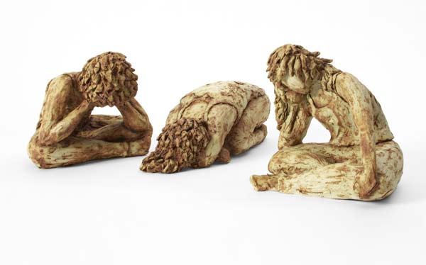
Untitled 2006 (detail)
earthenware
three works: 18.2 x 21.7 x 22.0 cm; 12.1 x 14.0 x 33.5 cm; 18.0 x 21.0 x 19.0 cm
Art
Firbank Grammar School, Brighton
These sculptures stemmed from an interest in the way that body language expresses emotion. The idea behind this work is that the body is just a vessel for expression of the inner self; the link between one’s inner world and the environment. I was inspired by expressionist artists such as Edvard Munch for their ability to show such deep feeling in their work, and to evoke an emotional response in the viewer. This was also my aim. By working with clay and using emotive poses, texture, contrast and shadow I was able to emphasise the sombre mood of the figures.
Todd Christy
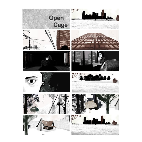
Open cage 2006 (detail)
DVD
2 minutes 40 seconds
Art
Orbost Secondary College, Orbost
My starting point was seeing a documentary about Mies Van Der Rohe and being struck by ambivalent feelings of freedom and imprisonment, feelings replicated in the bush that surrounds my home town. For my animation I explored these feelings as experienced in both a city and a forest. I used images with strong and stark vertical lines such as trees, buildings and power-poles to suggest an imposing hostility, contrasted with the freedom associated with birds in flight, which are an ubiquitous presence. Animation allowed me to juxtapose elements of drawing, photography and image manipulation into one seamless work. I created the score on a synthesiser.
Dharman Gersch
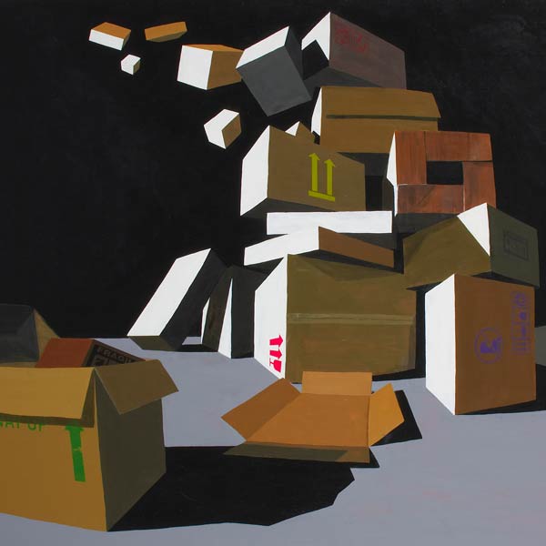
Cardboard boxes 2006 (detail)
synthetic polymer paint and screenprint ink on plywood
122.0 x 197.0 cm
Art
Melbourne Rudolph Steiner School, Warranwood
As a refreshing change from the depressing tendency of students to ‘spill their guts’ I decided to pursue primarily aesthetic goals, focusing on simplified geometric shapes, exaggerated light and shade, non-linear perspective and harmonic proportion. I also used everyday symbols which, while prosaic, also carry semiotic complexity. Combining these elements, I hand-painted everything freehand, except the screen-printed symbols, without using tape for the sharp edges.
Amy Marnie
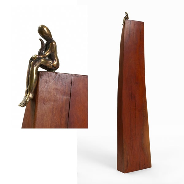
Amy Marnie
Waking up on top
bronze, wood
120.0 x 13.0 x 25.0 cm
Arts
Art
Describe the ideas behind your work short–listed for Top Arts
In all my works, I have used the simple shape of the house to represent the ‘inner self’. In my sculpture, “Waking Up On Top”, I have tried to infer a feeling of isolation by using a long, thin piece of wood from which a figure sits. On the other hand, the sculpture “Struggle” represents the struggle we have in everyday life, as the figure tries to hold his house literally above his head. In my paintings, I have chosen a limited palate of colours for their dramatic, moody appeal. I believe the most complex emotions can be evoked from the simplest of forms. I have also incorporated the symbol of bridges and ladders which symbolize the struggle to reach our goals. In this respect, the struggle is shown in the painting: “House” by the fragmented nature of the bridge.
What were your starting points? Where did your inspiration come from?
I was inspired by an exhibition I saw at the ‘Edward Gallery’ in Jakarta at the end of last year. Although I can’t remember the artist’s name, I loved the way he used simple bronze men to explore a range of emotions. One sculpture particularly inspired me, which was a bronze house with a family balancing on the roof. This led me to explore the notion of balance, struggle, and isolation within life. I used the house shape as my main symbol.
What media/materials did you select and why?
I chose to work with Red Gum wood in my sculptures because it has a beautiful dark, rich colour when refined. This compliments bronze quite well. Although bronze is a long process, the result at the end is nonetheless worth all the work. I chose acrylic paint because it dries quickly and allows me to apply the paint in a spontaneous and loose manner.
How did new technologies influence your ideas or working methods?
I used electrical tools – angle grinders, sanders, ext to refine the wood’s surface. The Internet and art gallery websites were great for researching.
What challenges/difficulties/discoveries did you encounter in producing your work?
The most challenging aspect of my work was the long and laborious process of the ‘lost wax’ method for making bronze figures. They took a long time to make, cast and finally be sent to the foundry. It was only at the end of the year when I discovered my own painting ability!
What exhibitions did you see in 2006? Was there a specific exhibition that influenced the development of your ideas and working methods?
Edward Art Gallery in Jakarta, Indonesia – this is the exhibition which lead me to explore houses.
Top Arts 2005
Pablo Picasso
Howard Arkley
Drawn together: the drawing lives of Nora Heysen, Judy Casab and Margaret Woodward
Next Generation, Ballarat Fine Art Gallery
Lida Abdul, ACCA
Did you see Top Arts: VCE 2005? If so, what was your response?
Yes – I was particularly impressed by the abstract paintings yet noticed there was a lack of large sculptures.
Discuss any ethical or moral issues or concerns evident in your work?
The isolating nature of the modern world is evident in my work. I am most concerned about the future, and how interaction between people is becoming more and more distanced as technology advances: mobile phones, Internet etc. In my paintings, house shapes are represented in isolation of everything else, or simply in a vast area of space to reflect this notion of isolation.
Did you consider presentation and conservation issues in the process and production of your work?
Yes, all of my work has been designed to last a long time. The wood has been polished to help prevent cracking. The canvases have been coated with varnish to conserve them. I wanted my sculptures not only to express my opinions, but also look stylish and delicate.
What advice would you give to students undertaking Art or Studio Arts?
To think of an idea or starting point before year 12 starts and then begin your folio straight away! Be ambitious but also realistic!
What were highlights of your arts studies in 2006?
Discovering the fun in painting – a great way to vent the stresses of year 12. I also enjoyed writing essays about artists such as Picasso, Goya, Booth and Ghittoes.
Are you planning to pursue a career in the arts? What will you be doing in 2007?
I am planning to show my work in a gallery and continue to paint. I hope to get into the ‘Creative Advertising’ course at RMIT.
Eleanor Weir
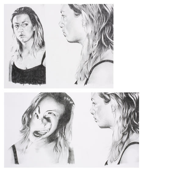
Mirror, mirror 2006 (detail)
pencil on paper
two works: 41.8 x 74.0cm; 42.2 x 54.2cm
Art
I began this series by exploring the concept of symmetry, which led to developing the theme of distortion through the use of mirrors. I looked at the idea of distorted perceptions of self, and how people have a tendency to focus on their faults and flaws when analysing their reflections in the mirror. Each image in the series depicts a different reflection. Using pencil I was able to exaggerate certain aspects of the face and make others more subtle, emphasising the transition between distortion and reality.
Krissie Hopkins
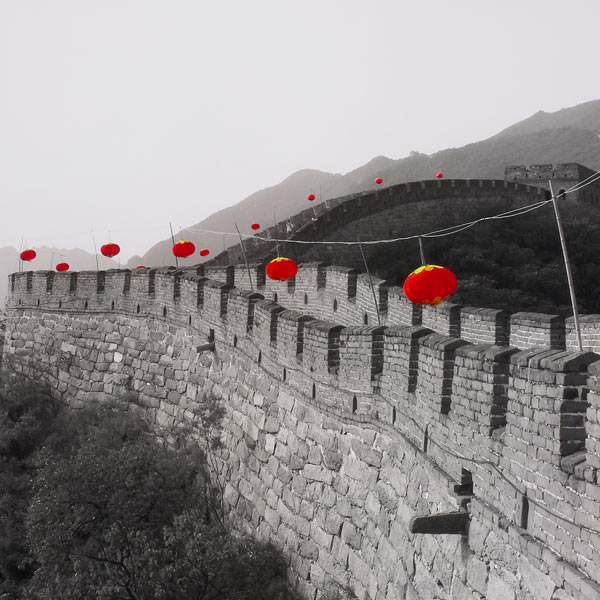
The Great Wall of China 2006 (detail)
inkjet print
40.5 x 50.5 cm
Art
Lilydale Adventist Academy, Lilydale
My visit to China was a life-changing and inspiring experience. I was impressed by the strength of the people I met, their hard lives and China’s long history of warfare. I walked on the Great Wall and wanted to share its breathtaking beauty and ancient power, which are still so evident today. I emphasized the red lanterns by using Photoshop, leaving them the only objects epicted in colour. This enhanced their repetition and the contrast between the solidity of the Wall and their bright buoyancy.
Tegan Sipthorp
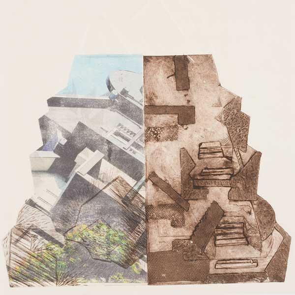
Untitled 2006 (detail)
collograph
46.2 X 37.5 cm
Art
Melbourne Girls' College, Richmond
I was exploring the housing estate in which I live, through experimenting with form and irregular shape. Irregular shaped prints are a characteristic of the work of Ray Arnold. In this work, I have explored this as a potential solution to my printmaking techniques, rather than using conventional rectangular or square formats. The jagged pyramid form is derived from roof tops and provides a classical pyramid composition which gives order and balance to the design. I employed collograph printmaking techniques to transfer the imagery of the photographs on to the paper and I then overlayed acetate etchings on top to create depth in the final experimental design.
Cameron Richard
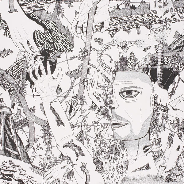
Mutilation 2006 (detail)
pen and ink on paper
55.5 x 75.0 cm
Art
Kingswood College, Box Hill
My work was primarily influenced by James Gleeson and Peter Booth and reflects my interest in drawing the human anatomy. I wanted to create imagery that worked on both a logical and aesthetic level. The emotionless face in the drawing serves as the focal point in a chaotic and destructive landscape. I believe that drawings generally receive less attention than other media, which is one of the reasons why I decided to work in pen and ink. The challenge in using these media was in creating the detailed tonal variations and perspective on a large scale as well as expanding on the original concept as the drawing took shape.
Ruby Carrodus
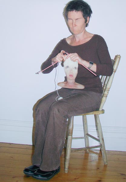
Making faces 2006 (detail)
inkjet print
82.4 x 58.0 cm
Art
Loreto Mandeville Hall, Toorak
I began with portraits but wanted to explore facial expressions in depth. Working with Photoshop allowed me to produce my ideas and morph expressions in a surreal way. Expressions can encapsulate a feeling, opinion, mood, emotion, sentiment, sensation or passion. People can find it difficult to express themselves visually and verbally and often make faces as a way to try to fit into their surroundings. In my works, people are creating their expressions in a unique way.
Claire McArdle
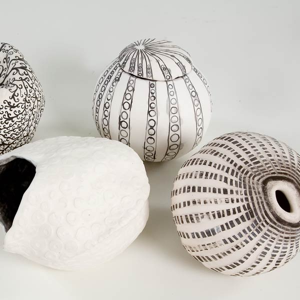
The human condition 2006 (detail)
earthenware
four works: 13.0 x 19.0cm; 18.5 x 12.0cm; 12.0 x 16.0cm; 14.0 x 12.0cm
Art
Loreto College, Ballarat
Each ‘sphere’ encompasses aspects of the essential qualities and attributes associated with the human condition. These ‘spheres’ represent the idea that we all have the same beginning, but then we are shaped and moulded by our genetics and our environment into the individual and imperfect beings we are. Each piece was created by a two-part mould but, as with human development, the evolution of both internal and external characteristics resulted in individual profiles, none quite the same, none free of imperfections, each a tribute to its own journey.
Marisa Matear
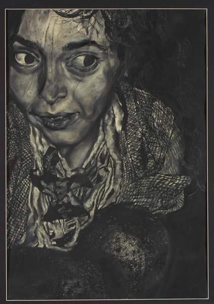
Autumn series 2006 (detail)
pastel on paper
66.0 x 46.0 cm
Art
St Catherine's School, Toorak
This is one of a series of reflections that depict the fantasy life of my friend and me when we pretended to be pixies and urchins amongst the autumn leaves in the Botanic Gardens. I created the different textures to illustrate the subtle quality of the leaves and our clothing, using both blended and unblended areas of soft pastel. The conspicuous emphasis on the eyes suggests the eerie but fantastic night atmosphere surrounding us.
Esther Stewart
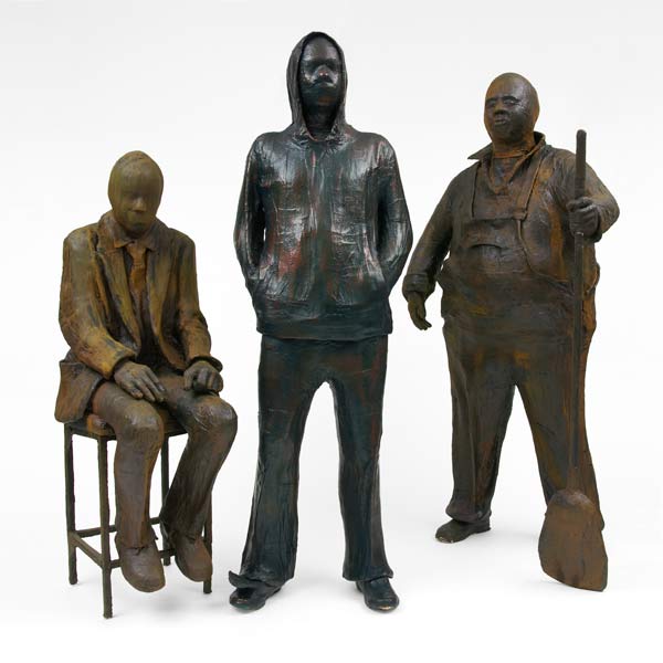
Terry 2006 (detail)
plaster, bondcrete, paint, shoe polish, shellac, stud, adhesive, fabric, plasticine, straw, timber, leather
175.0 x 80.0 x 66.0 cm
Art
Ballarat Grammar School, Ballarat
I have produced works that capture individuality. Untitled expresses how society is threatened by, and distrustful of, young people who choose to identify with their own subculture. This character symbolizes society’s tendency to negatively judge all youth as the same, to label and to fear them. Terry represents many Australian males. To be overweight is to find oneself the unwitting subject of public scrutiny and at times of outrage and disgust. This work is a cry to see the individual behind our preconceptions. We are overloaded with images of celebrities. Reality television turns extroverts with narcissistic personalities into social icons. By using implied metal patinas over plaster my intention is to portray resilience and depict the ordinary as extraordinary.
Matthew Rawls-Allen

from the End of the line series 2006 (detail)
inkjet print
37.0 x 52.6 cm
Art
Westbourne Grammar School, Truganina
The rapid obsoleteness of technology is a major concern for those who feel responsible for ensuring a sustainable future. As technology becomes more advanced, newer equipment comes into operation and out-of-date equipment is readily disposed of. Whilst waiting to be recycled in a scrap yard in the western suburbs, these railway carriages have become vehicles for graffiti. The End of the line series captures the unseen beauty in something which is usually regarded as ugly scrap.
Sophie Gosper
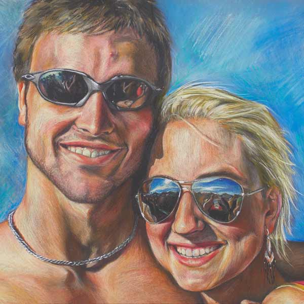
Siblings 2006 (detail)
pastel pencil on paper
46.5 x 67.0 cm
Art
St Catherine's School, Toorak
This work is part of my exploration of atmosphere and how it affects human emotions. The work depicts a layer of symbolism, with the scene reflected in sunglasses and through the happy facial expressions of the siblings and their unconditional love. By using pastel pencils I was able to enhance the realism and fine details. The use of grey paper intensified the colours.
Clare Pettyfor
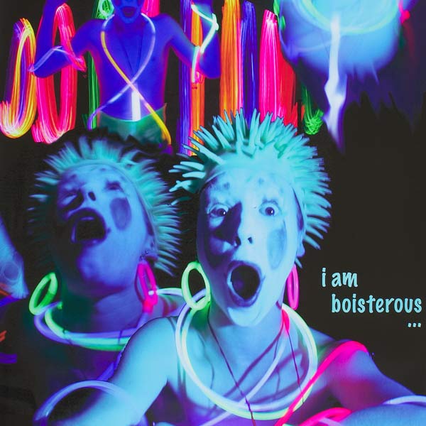
from the Cirque cadenza series 2006 (detail)
inkjet print
183.0 x 120.0 cm
Art
Mater Christi College, Belgrave
My intention was to create a series of banners advertising an imaginary circus – Cirque Cadenza. I aligned each performer with a genre of music, for example Pop, Classical, etc. The process of capturing each in a unique and individual manner involved not only introducing make-up and costuming but varying the source of lighting for each shot, experimenting with spot lights, projection, rope and fairy lights, as well as using mirrors/reflection. I wanted to capture the essence of movement, to produce aesthetically pleasing results, which were dramatic and subtle, but it was also important to me that I captured a ‘true’ shot, achieving the desired effect without digital manipulation. The format enhances the boldness, accentuating and promoting the drama.
Georgie Mattingley
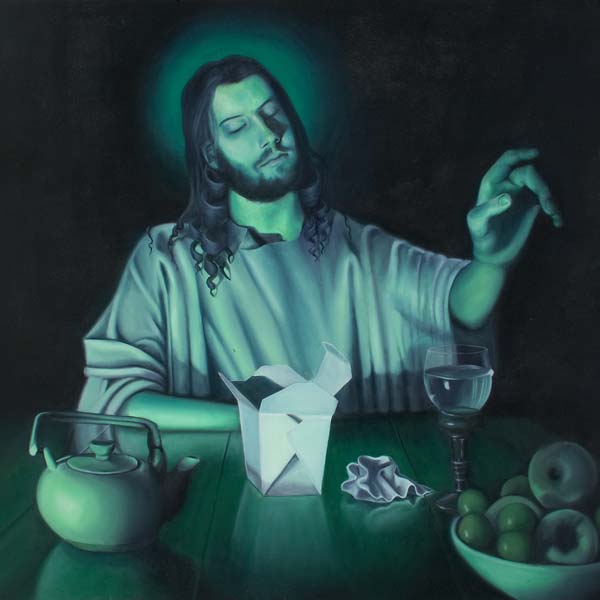
Supper 2006 (detail)
oil on canvas
152.0 x 213.0 cm
Art
St Leonard's College, Brighton East
I was inspired by my visit to the Louvre in 2005 and by seeing large Italian masterpieces. My reappropriation of Caravaggio’s masterpiece, Supper at Emmaus, is intended to create tension by incorporating bold and contemporary symbolism with harmonious surroundings. My painting of the Last Supper reinterprets the famous scene from the Bible and demonstrates how, in modern times, our internal feelings of enlightenment may clash with our external environment.
Prue Lester
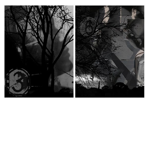
Suspense 2006 (detail)
inkjet print
two works: 72.0 x 54.0 cm each
Art
The intention of my artwork was to evoke an atmosphere of suspense by manipulating light and visual forms using digital photography. The work was originally designed as an installation including sound, and was designed to stimulate one’s senses. It can be viewed as a series, or the pieces can be seen individually, as symbolic representations of how suspense, particularly of a sinister nature, can be created. I was influenced by artists such as Alfred Hitchcock. I investigated how suspense is evoked in film and media and the public’s response to the theme.
Hamish Munro
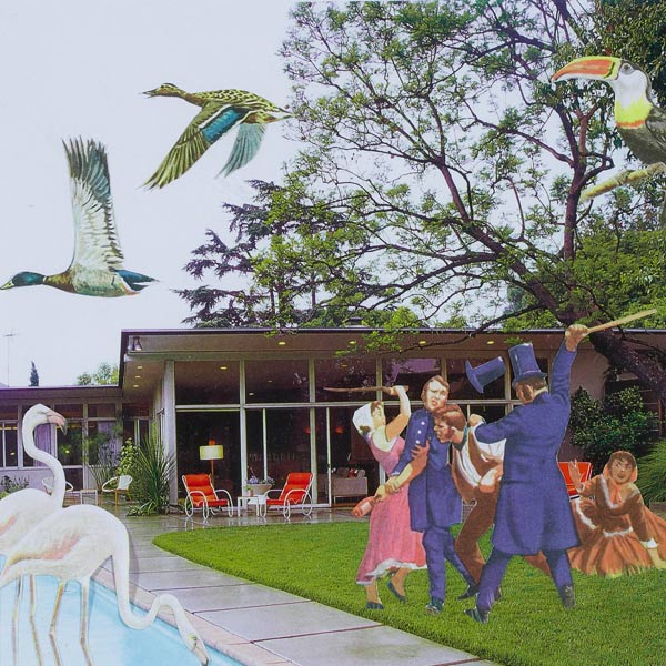
Untitled 2006 (detail)
collage
18.0 x 19.0 cm
Art
Preshil, Kew
I produced a series of photomontages which were inspired by the works of dada artists like John Heartfield and Max Ernst. The theme throughout the series highlights strange and surreal garden scenes and landscapes. I created these by arranging and pasting found images from rare old books and new magazines. The series is created to look as if each montage was captured in a fictional garden estate called ‘Crazy world’.
Nicolle Reeves
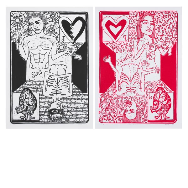
Queen of Hearts and Jack of Hearts 2006 (detail)
wood-cut
two works: 60.5 x 42.0 cm each
Art
Loreto College, Ballarat
My topic for the year was the Seven Deadly Sins. After researching aspects of Anger, Gluttony, Envy, Sloth, Greed, Lust and Pride, I incorporated physical representations of each of the vices into a single print titled ‘The Queen of Hearts’. I then worked to portray a set of vices relevant to the evolution of society today. Dishonesty, Cruelty, Selfishness, Greed, Adultery, Bigotry and Hypocrisy are what I defined as the modern set of sins and I portrayed these in a second print called ‘The Jack of Hearts’. My work emphasises the gradual process of moral decay in an ever-changing world.
Kathleen Pham
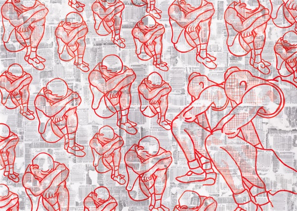
Band of brothers 2006 (detail)
synthetic polymer paint and ink on paper
65.0 x 91.0 cm (detail)
Art
South Oakleigh College, South Oakleigh
My final work explores the concept of unison through sport. My intention was to convey feelings and emotions felt in both victory and loss. I illustrated the close relationship of team-mates and the sense of brotherhood, influenced by sporting events held in Melbourne, including the Commonwealth Games. The numerical aspects of sport betting, scores and statistics were expressed through printing on paper using an ink-dissolving citrus solvent method.
Samii Melbourne
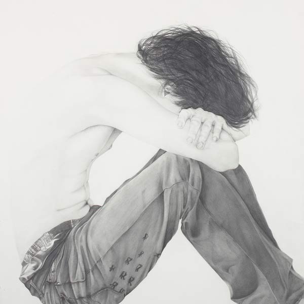
Rob 2006 (detail)
pencil on paper
155.9 x 122.0 cm
Art
John Paul College, Frankston
My work explored human anatomy and emotions and their relationship to body image. Leonardo da Vinci, Derek Hess and a drawing in Top Arts in 2005 influenced the development of this theme. I wanted Rob to reflect the feelings of insecurity and uncertainty which are experienced by so many people regardless of gender, race and/or culture. I used graphite pencils from B to 8B to achieve a variety of tones.
Stephanie Perrin
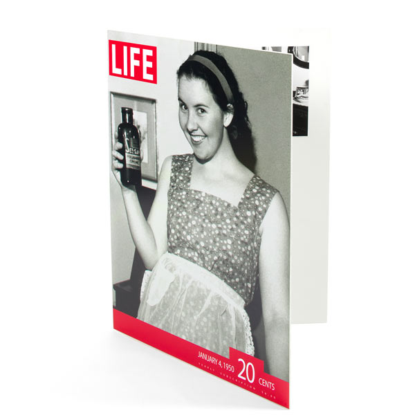
Life: Women throughout history 2006 (detail)
inkjet print, gelatin silver photograph, pine
84.0 x 59.7 x 10.5 cm
Art
Ballarat and Clarendon College, Ballarat
The main theme for my exploration was women throughout history. I explored stereotypical imagery, roles and advertisements of three main periods: the 1950s, 1970s and today. I used a combination of gelatin silver print as well as digital photography to produce my final works. I incorporated the idea of advertisements and images from Life magazine to produce the magazine format.
Edan Azzopardi
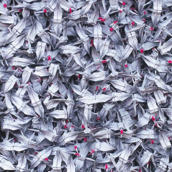
One thousand cranes 2006 (detail)
inkjet print
86.5 x 61.0 cm
Art
Reservoir District Secondary College, Reservoir
I have always been interested in Japanese culture. My artwork is based on the story of Sadako Saski, who was diagnosed with leukaemia after the Hiroshima bombing in World War II. Sadako folded one thousand origami cranes, based on a legend that by doing so she would be granted a wish – that she would live. Using Photoshop I created paper cards with my own design so that when I folded the cranes they would have black wings and a red head to keep them traditional in appearance. It took several months of folding to complete the task. I found that a simple photograph captured the details in an effective, yet simple, way.
John Thompson
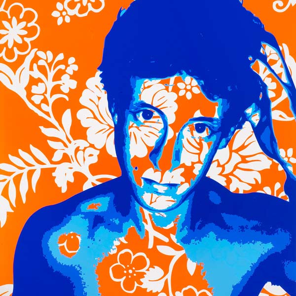
Self portrait I 2006 (detail)
vinyl on transparent polymer resin
86.6 x 61.0 cm
Art
The Peninsula School, Mt Eliza
This series evolved from my research into portraiture in 1960s and 1970s British art, and was alsoinfluenced by the work of Howard Arkley. I incorporated stylization and simplification, psychedelic elements including flowing lines and paisley patterning, with vivid complementary colour schemes. I also utilised elements of spray and graffiti art, multilayered designs and stencilling. The figures were created from manipulated digital images, which were split into separate tones and applied to vinyl before each layer was cut using a Roland cutter, a traditional sign-writer’s tool.
